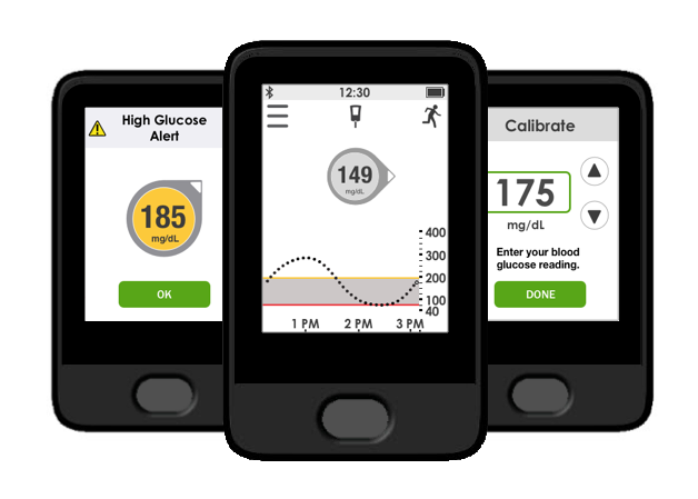
G5 Continuous Glucose monitoring receiver
Role
Interaction Designer
I was teamed with a visual designer; we shared responsibilities conducting ideation, lo-fi sketching, hi-fidelity mockups, and prototyping.
Teams collaborated with: software development, marketing, usability testing, content, technical support, and regulatory.
Project timeline: 11 months
Overview
Continuous Glucose Monitoring (CGM) provides continuous insight into glucose levels throughout the day and night. The device displays information about glucose direction and speed providing users additional information to help with their diabetes management.

The CGM System consists of three parts:
a small sensor that measures glucose levels just underneath the skin
a transmitter that fits onto the sensor and sends data wirelessly to your display device
a small receiver or compatible smart device that displays real-time glucose information
The CGM also provides customizable alerts to warn the wearer of approaching glucose highs and lows.
Problem
The Dexcom G5 receiver is planned for obsolescence, and will be replaced with a new unit that will feature a touchscreen interface. Since the user interactions are different from a d-pad interface to a touchscreen, the UI needed to be redesigned to work with a new display.

Challenges
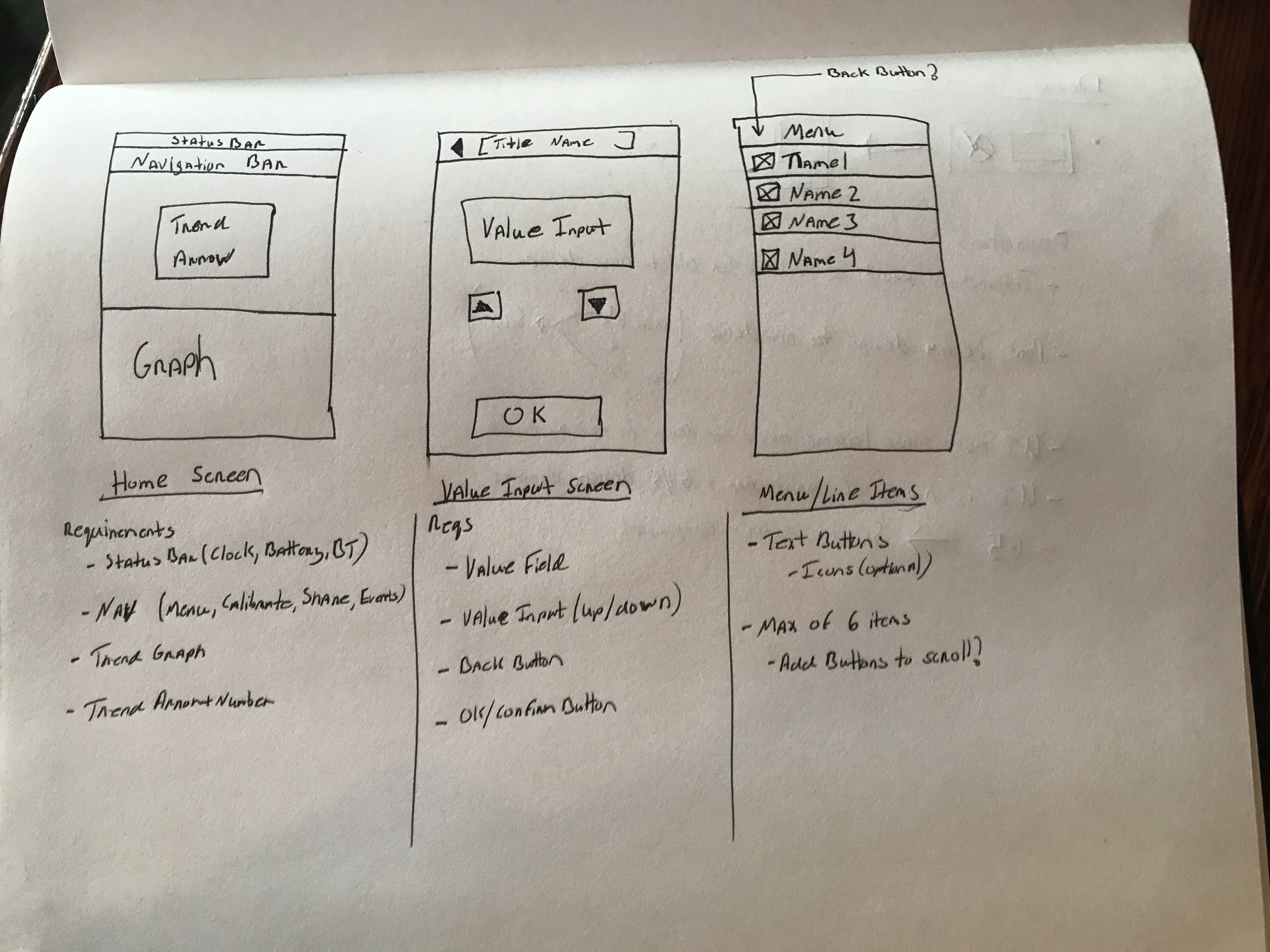
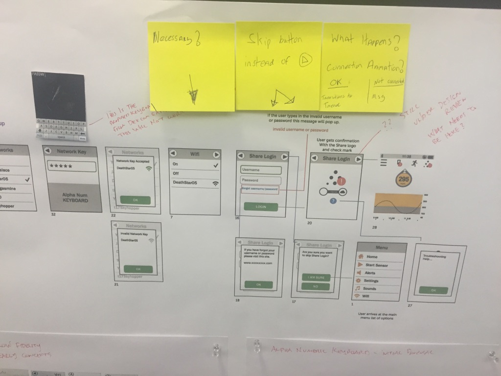
Designing for a small screen is challenging, but I enjoyed the journey in trying to figure out what works, what doesn't work, and "out of scope". With a small touchable display screen brings a lot of what-if questions/scenarios about accidental touches and "pocket-dialing"? Are the buttons the right size and in the right place? Can it be as feature rich as the mobile app? To counteract these scenarios there were plenty of cycles to produce wireframes, prototypes, usability tests to test designs with users until a solution was found, or if there was enough data to push back on a feature.
Process
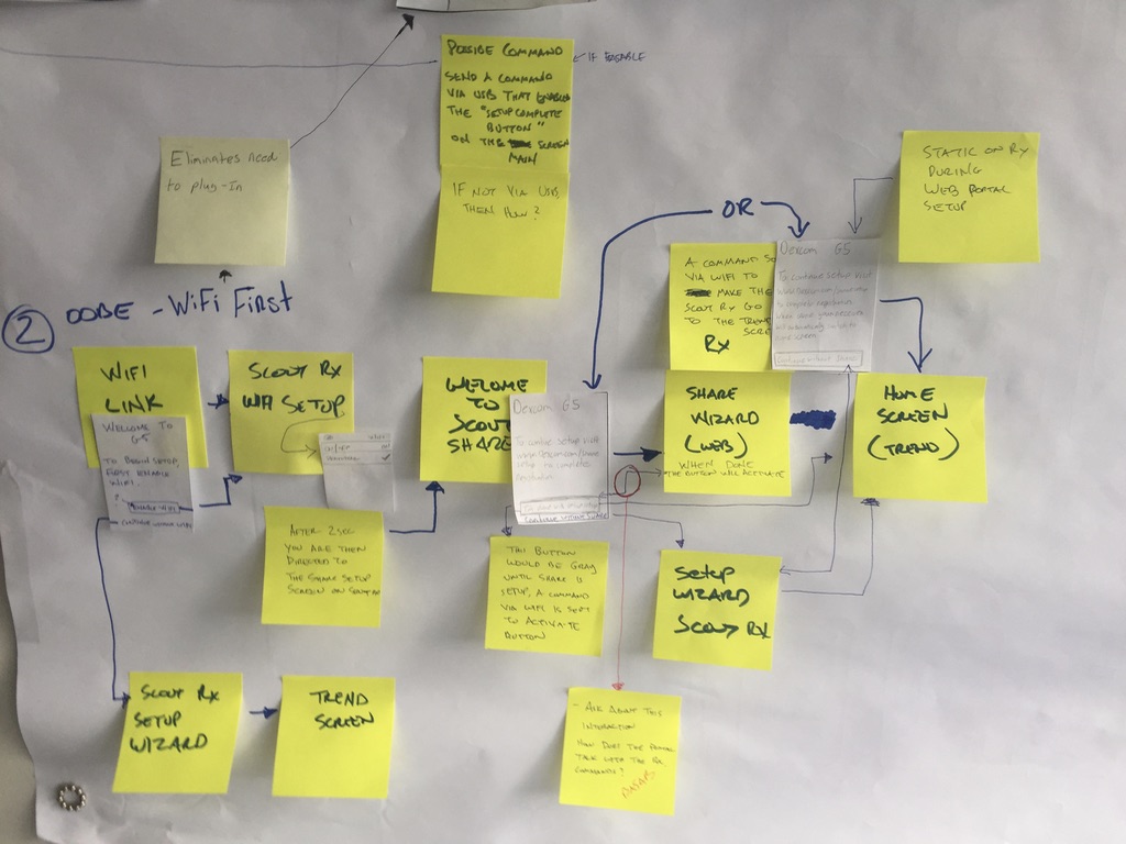
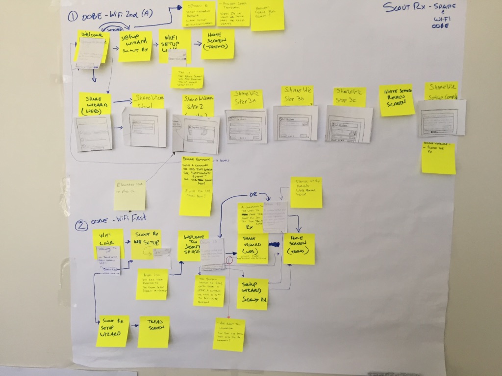
With the addition of the G5 mobile app to the CGM system, it was believed that many users would gravitate to their smartphone using the receiver less. For the small amount who would primarily use the receiver, it was likely an older demographic of whom is not tech savvy nor use a smartphone. This was the persona we designed for.
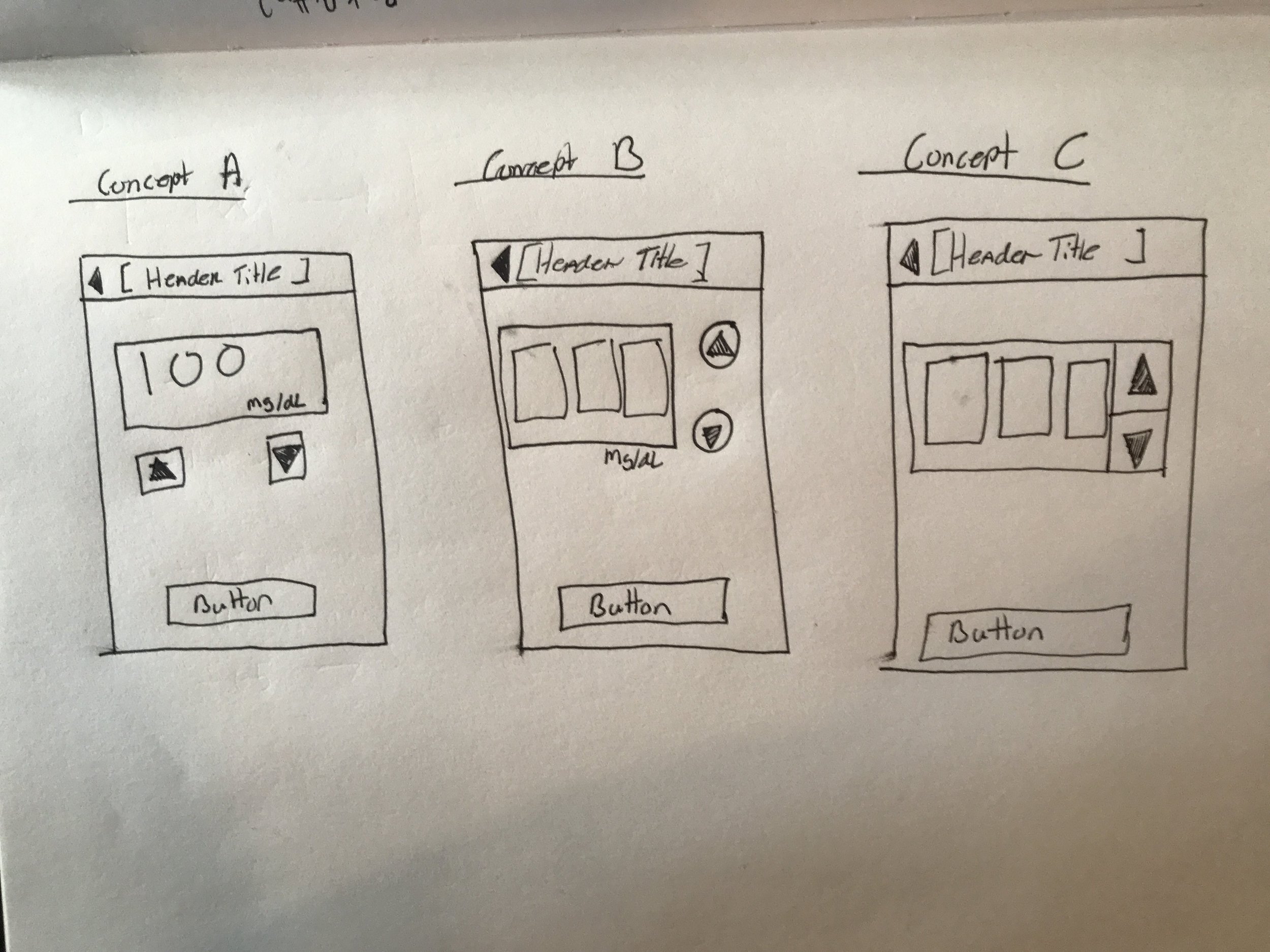
Our goal was to design a compact version of the G5 mobile app, and apply the new Dexcom brand styling to be consistent with their existing products and services. Using the G5 app as the guide for intended look and feel we discovered that there would be many design compromises due to the smaller display size (240x320). This meant leveraging the receiver legacy design or creating something new.

Despite the new hardware we were designing for, this was essentially a re-skin design project. With that in mind our design team took the existing architecture and screen flow to brainstorm ideas on what the touchscreen experience for the user should be, and how to integrate new features into the architecture. We prioritized features on what was feasibly in scope and sketched out designs and workflows to prototype and test with users.
Solution
The final layout is a hybrid of the new mobile app and legacy receiver. When technical restraints blocked desired interactions, I worked with the lead developer to find the best compromise. The result was a new receiver interface that passed usability tests, meets FDA standards, and matches new brand styling.
Result
The new receiver released in early 2017 with a limited launch, and full release in Q4. Dexcom now has a complete CGM system with consistent branding across both platforms. Users who navigate between the mobile app and receiver will have the same core experience.

Screen Comparisons
Home Screen
Before

After

Problem
Home screen layout was inconsistent with new branding style
Solution
Matched G5 mobile app look and feel, and is consistent with new branding
Calibration Input
Before

After

Problem
New users had trouble understanding what to do. "Enter BG" was misunderstood.
Solution
Added instructional text and retitled screen to "Calibrate" to be more clear on what is needed.
Error Screen
Before

After

Problem
Users didn't understand error states and contacted customer support for help. "???" indicator is often misunderstood.
Solution
Added modal style indicator that is more clear about what's happening, what to do, and choice for more information.
Glucose Notifications
Before

After

Problem
Screen size was too small to properly explain notification
Solution
New display size allows the room to add more text to explain alert better and add graphic to emphasize it's importance.
Calibration Notifications
Before

After

Problem
Calibration notification with blood drop image was not received well with first-time users.
Solution
Added content to explain notification and give user option to calibrate now or later.