G6 cGM Receiver
Role
Lead Interaction Designer
I was responsible for conducting ideation, lo-fi sketching, hi-fidelity mockups, and prototyping.
Teams collaborated with: software development, marketing, usability testing, content, technical support, and regulatory.
Project timeline: 8 months
Overview
Dexcom G6 is the next generation of their CGM system replacing the G5 version. It uses a smaller and more accurate sensor. The CGM receiver and mobile app will have new features including new alerts, and notifications.
Opportunity
The G5 mobile app UI was slated for redesign, which meant the touchscreen receiver had to follow suit. For the receiver, this was also an opportunity to improve the user experience from the G5 receiver.

Challenges
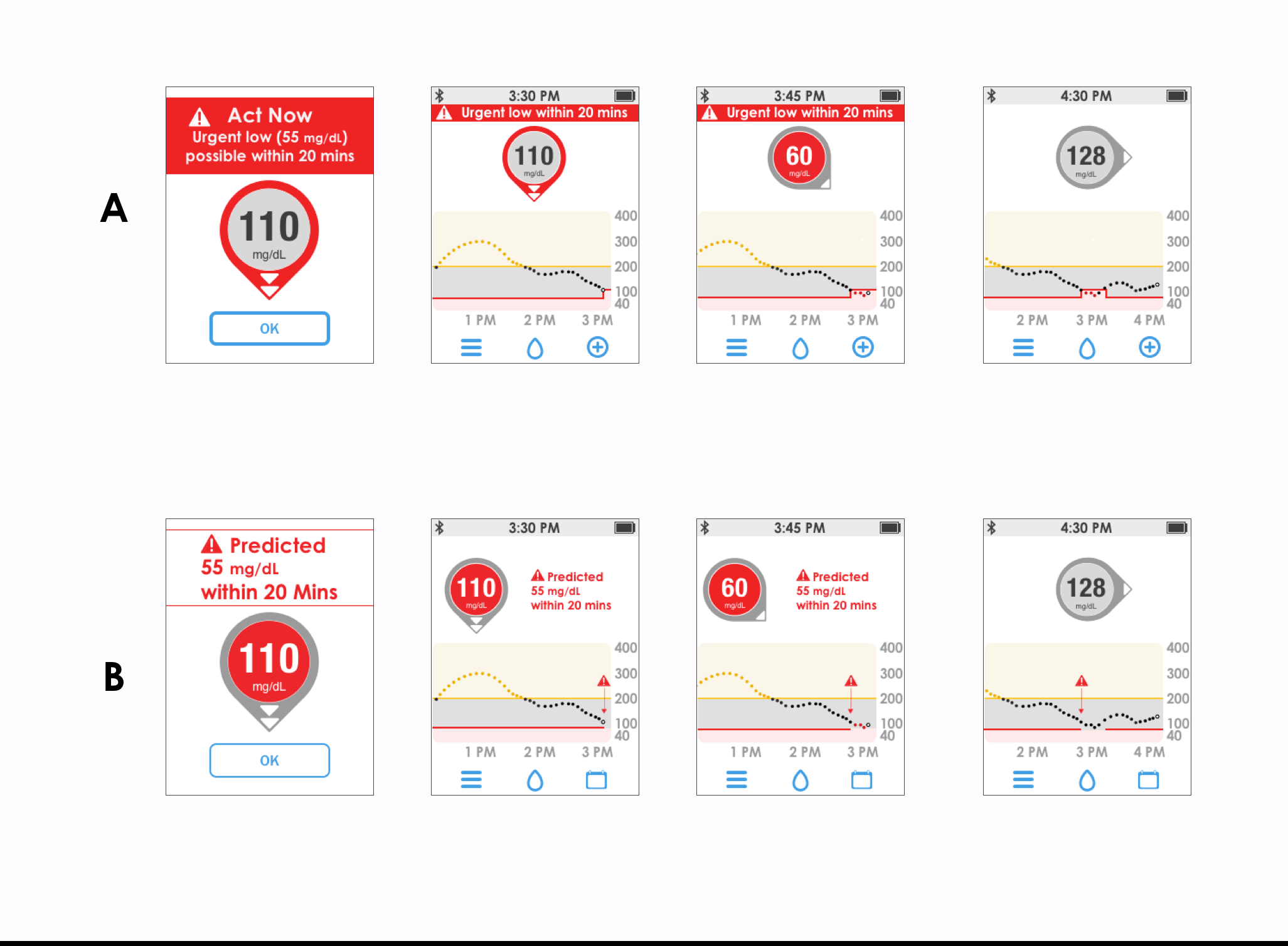
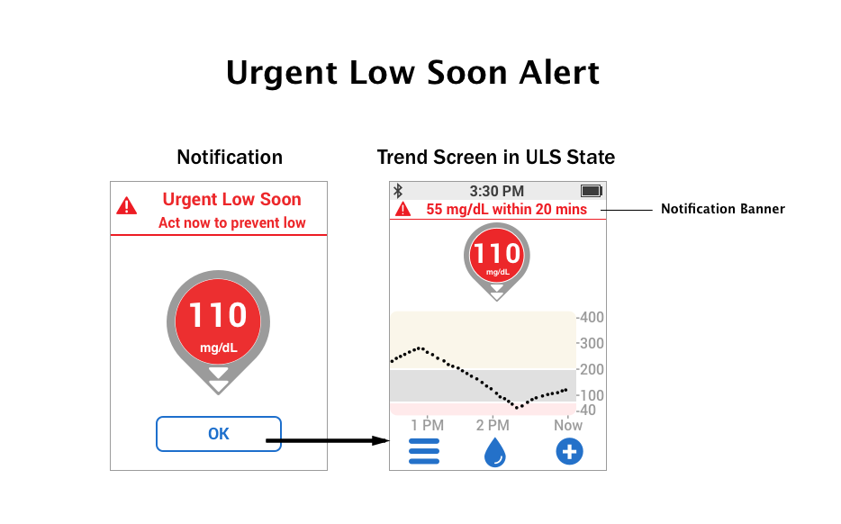
Start small and go big! The key feature to design for was the 'Urgent Low Soon' alert, which alerts users when a severe low is approaching and they should take action in correcting their glucose levels. That said, with a small display to design for an informative alert with the right amount of verbiage and pixel space was crucial. If the solution if effective for the touchscreen receiver it will definitely work on a larger smartphone display.
Process
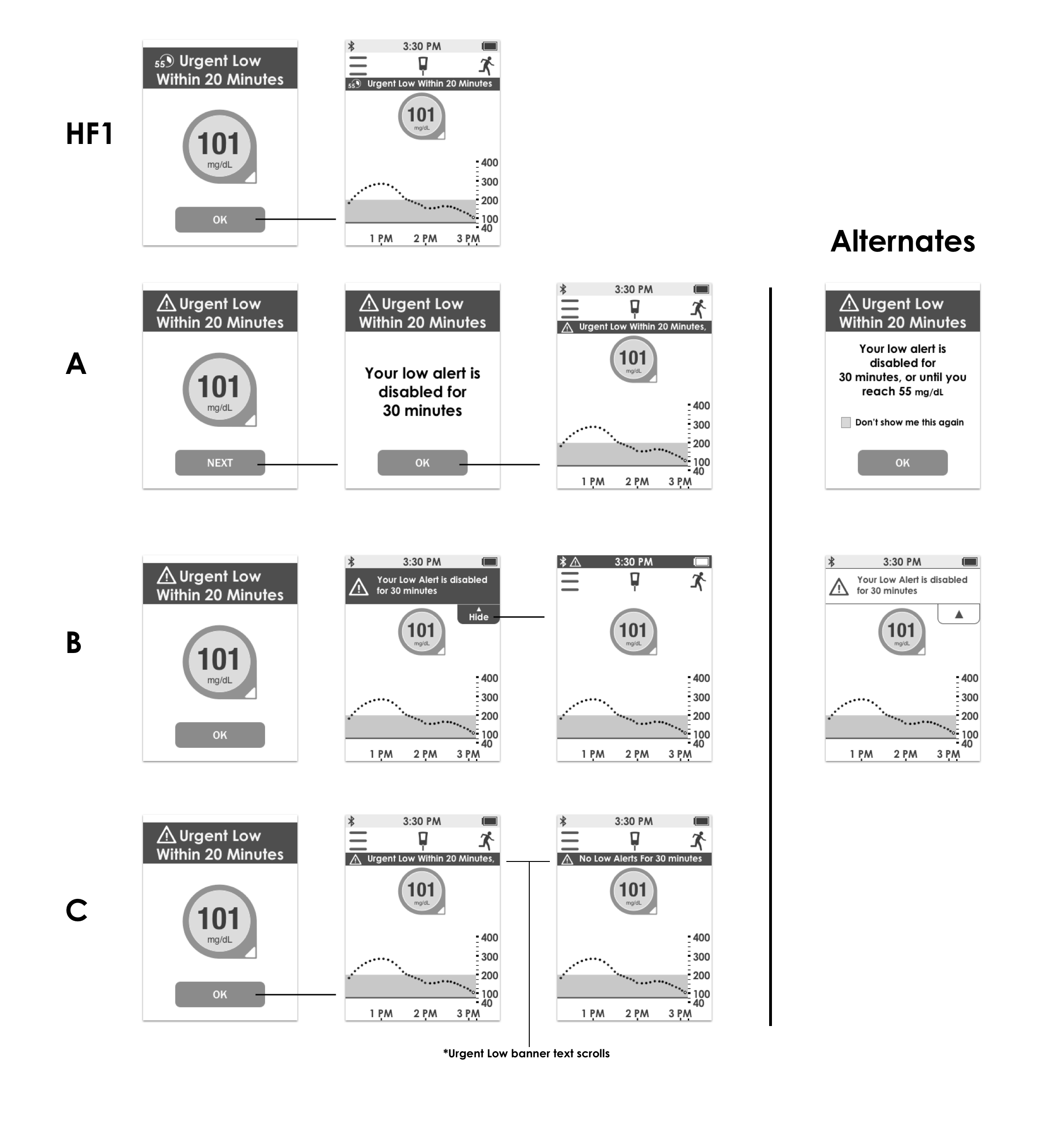
My focus was around the new alert features which make up the core of the G6 system. There were past concepts to leverage, but the trick was seeing if the layout can work on a smaller screen. I researched different applications to see how their on-screen notifications were designed and their behavior. Sketches on paper would quickly turn into high fidelity mockups because there wasn’t much pixel space to work with.
A range of concepts where used in usability tests to get feedback on use of color, placement of notification, and the wording of the notification. With the feedback the concepts were refined and retested until a solution was found.
Solution
After 3 rounds of testing it was discovered that banner style of notification was best understood. The banner notification is an already familiar element for users of smartphones and the web. We were also able to utilize the banner style for other device states such as error screens.
Result
The G6 system was approved by the FDA and launched in Spring of 2018. For the G6 receiver, the UI was thoughtfully redesigned to address issues discovered from the previous version. In addition to the new system features, there were changes to color, font, icons, content, and overall better understanding of alerts and notifications with improved layout.

Screen Comparisons
Home Screen


Problem
Two of the three navigation bar icons were misunderstood by first time users.
Solution
Replaced icons with images that represent the intended action better. Moved navigation to bottom to be more thumb friendly.
Calibration Error Screen


Problem
The message "Calibrate in 15 min." could be more descriptive like in the G5 mobile app.
Solution
Added a timestamp to help user know the exact time to calibrate. Added a 'Help' button to provide more info when needed.
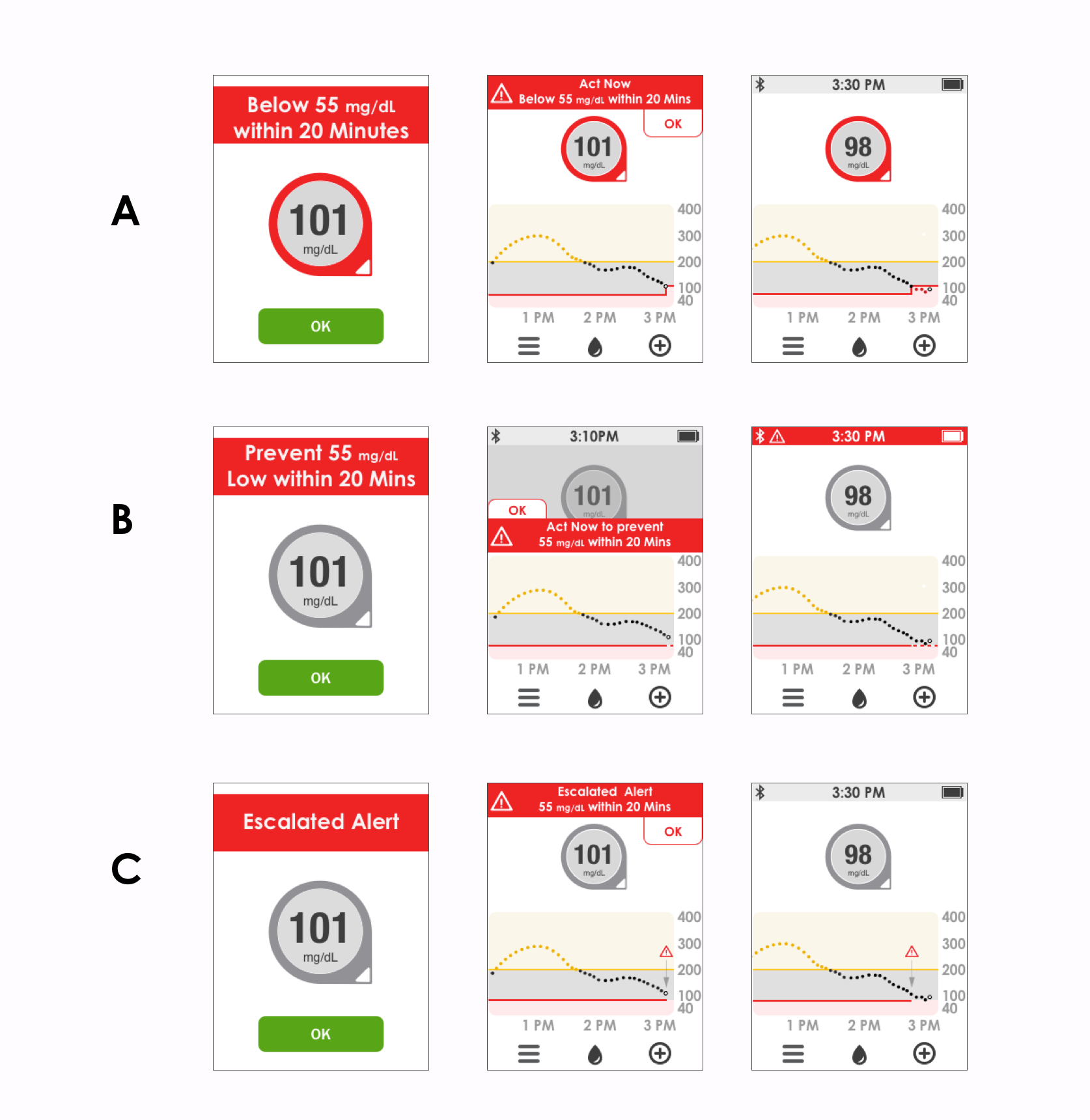
Urgent Low Glucose State


Problem
Urgency of Urgent Low state was not emphasized enough to have user take action. With the Urgent Low Soon state being added, it could be confusing to user to emphasize the lesser state over the most important.
Solution
Added banner notification to trend screen to indicate Urgent Low state.
Sensor Warmup


Problem
Flashing icon in status bar that indicates sensor warmup session was unknown to users.
Solution
Added a larger countdown ring to indicate time remaining before session ends.